WOWHOUSE invented the name and developed the corporate identity of deluxe real estate agency Finch. We were assigned to create a brand whose name “…would sound pleasantly in both Russian and English, with simple spelling. It is desirable that the word would be no longer than 8 symbols. And it should not contain the words realty and estate”. The brand itself “…does not dominate, it is capable of listening, but it speaks so that nobody interrupts it. It is emotional so much as to inspire you. It is excitable so much as to give you shivers. We understand and value its professionalism; at the same time, it does not pressurize, nor manipulates you, nor boasts of its expertise. It shares not secrets, but ideas, giving you the opportunity to make an independent decision”. After reading this wonderful brief we fell in love with the project.

This is a finch. It lives in Moscow and the Moscow Region.
eet Mr. Finch. It is a finch from Moscow; it lives at the Finch realty offices in Ruzheiny Lane. This is the very first Finch brought by our Chief Art Director in an empty sour-cream jar. He has a dacha in Aprelevka outside Moscow, a shed filled with saws and planers; there, he carved our first bird from a piece of wood. By that time, we knew that the new agency would be called Finch, but we had no idea as to how the bird would look like. It was for the first time in our history that we saw the ready trade mark in a glass jar. Everybody crowded around the table silently looking at the wooden finch. Someone said “Cool!” The designer agreed: “Cool indeed! I’m gonna make it a house!”


We long searched for the form and proportions of Mr. Finch. We made it from plasticine, carved it from wood, printed it on a 3D printer. But the initial one, made of wood, is still the most loved.

Mr. Finch’s emblem. And a good slogan (“A bulwark of constructive egotism”). At any rate, we like it, and the client likes it, too.

The tree of Mr. Finch and his friends.

Mr. Finch’s favorite colors.

Mr. Finch on a business card. Note Mr. Finch’s excellent domain name – thanks to the client. We have found an adequate graphic realization of it.


A sign on Mr. Finch’s house.

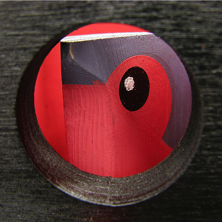
Mr. Finch sitting on a letter of his name in his house.
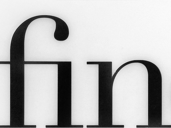
Fin — the end. The end of the birth process. How wonderful that for the real estate agency Mr. Finch became a lively, ever fascinating and never despairing symbol of their business.


